Seizure-Action-Plan
Value-Centric UX Research & Design for Rapid Pediatric Seizure Response

About the Project
SAP (Seizure Action Plan) is a mobile health application that securely hosts patient-specific seizure action plans to support caregivers, educators, and clinicians in responding to seizures effectively.
Developed by the Digital Lab in collaboration with the BC Children's Hospital Division of Neurology, the platform ensures every child's care plan is accessible anytime, anywhere ,when seconds matter most.

Design Process Overview
| Phase | Focus | Key Outcome |
|---|---|---|
| Planning | Page & flow mapping, feature inventory, defining goals | Structured product map & prioritized evaluation plan |
| Research & Audit | Stakeholder and caregiver interviews, heuristic review | Pain points in readability & decision-making speed |
| Value Prioritization | Assigning importance weights to features | Aligned user and stakeholder goals (BCCH & caregivers) |
| Ideation & Design | UX redesign of the Action Plan Flow | Two design versions for testing |
| Testing & Refinement | Behavioral A/B testing via Maze (250 users) | Reduced reading time & unnecessary 911 calls |
| Future Phase | LDigital nudges & decision support | Improved focus and reduced task friction |
Phase 1 : Planning & Product Mapping
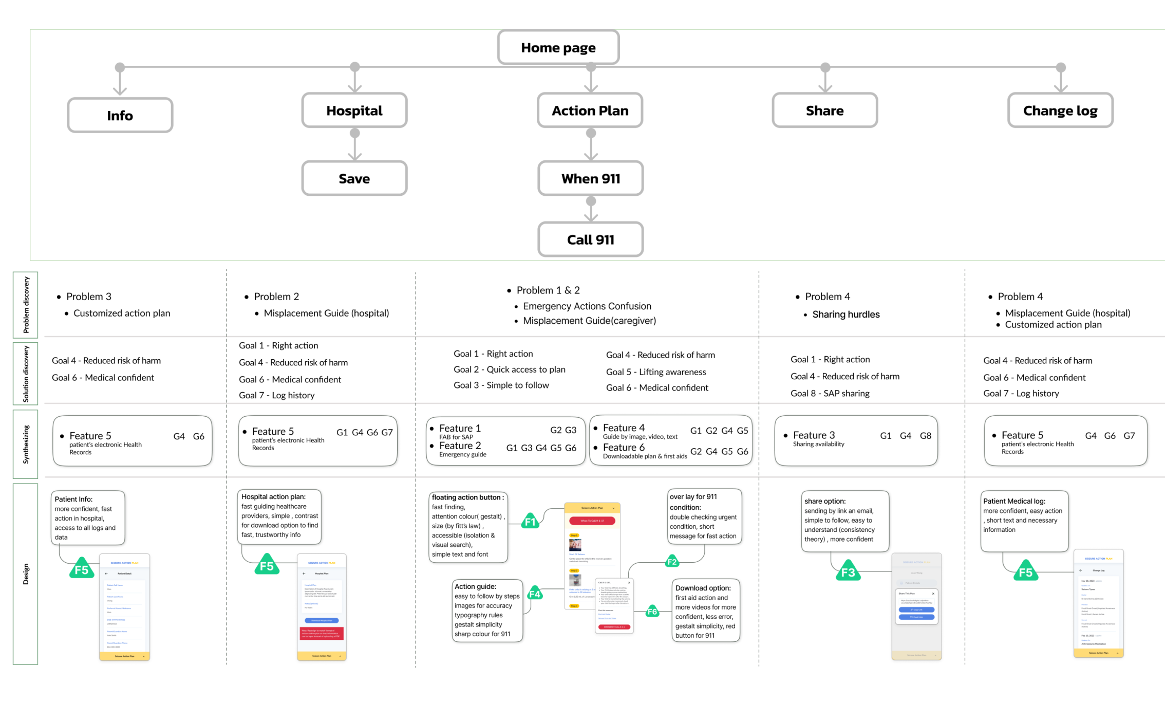
The project began with systematic planning of all pages, user flows, and app structure, listing every feature and its intended purpose.
We adopted a value-centric design evaluation approach, aligning product goals with the stakeholder's mission (BC Children's Hospital) whose priorities mirrored those of caregivers: clarity, speed, and safety.
Activities
- Created a complete application sitemap and feature list.
- Defined user journeys across roles (clinician, caregiver, educator).
- Evaluated the product through a value hierarchy: assigning numerical weights to each goal according to its clinical and user significance.
- Identified the primary user goal: “Access, understand, and act on the child's personalized seizure plan and call 911 only when necessary.”
Phase 2 : Research & Audit
The audit and research process focused on understanding why caregivers struggled to follow existing action plans and how the design could reduce cognitive load during emergency use.
🔻 Key Findings Problems
- Complex, text-heavy layouts delayed comprehension of urgent steps.
- Main CTA (“Call 911”) visually competed with non-critical options.
- Lack of structure for personal plan data led to user confusion and overreaction.
- High number of unnecessary emergency calls traced to poor UI hierarchy and missing visual cues.
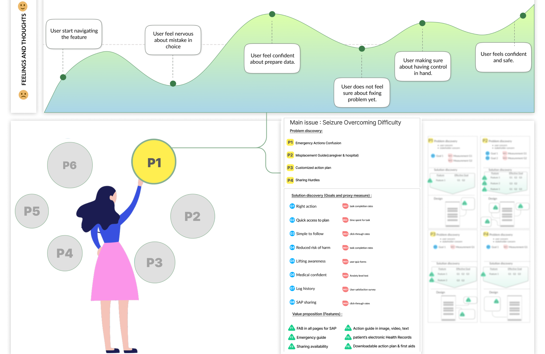
Phase 3 : Value Prioritization & Core Goal Definition
After mapping all features and flows, each goal was rated by importance based on:
- Stakeholder priorities (BCCH clinical protocols)
- User goals (caregiver clarity and rapid access)
- Risk level (impact on safety and time-sensitivity)
Top-Rated Value Goal:
Enable caregivers to read and act on the personalized seizure plan quickly (speed) and call 911 only if the plan fails. (readability)
Phase 4 : Ideation & Design Direction
Based on insights and value mapping, the design team brainstormed ways to:
- Improve visibility and accessibility of the primary CTA.
- Simplify the Seizure Action Plan reading experience.
- Support dual-system decision-making (fast vs. deliberate thinking).
- Clarify thresholds (when to intervene vs. when to call 911).
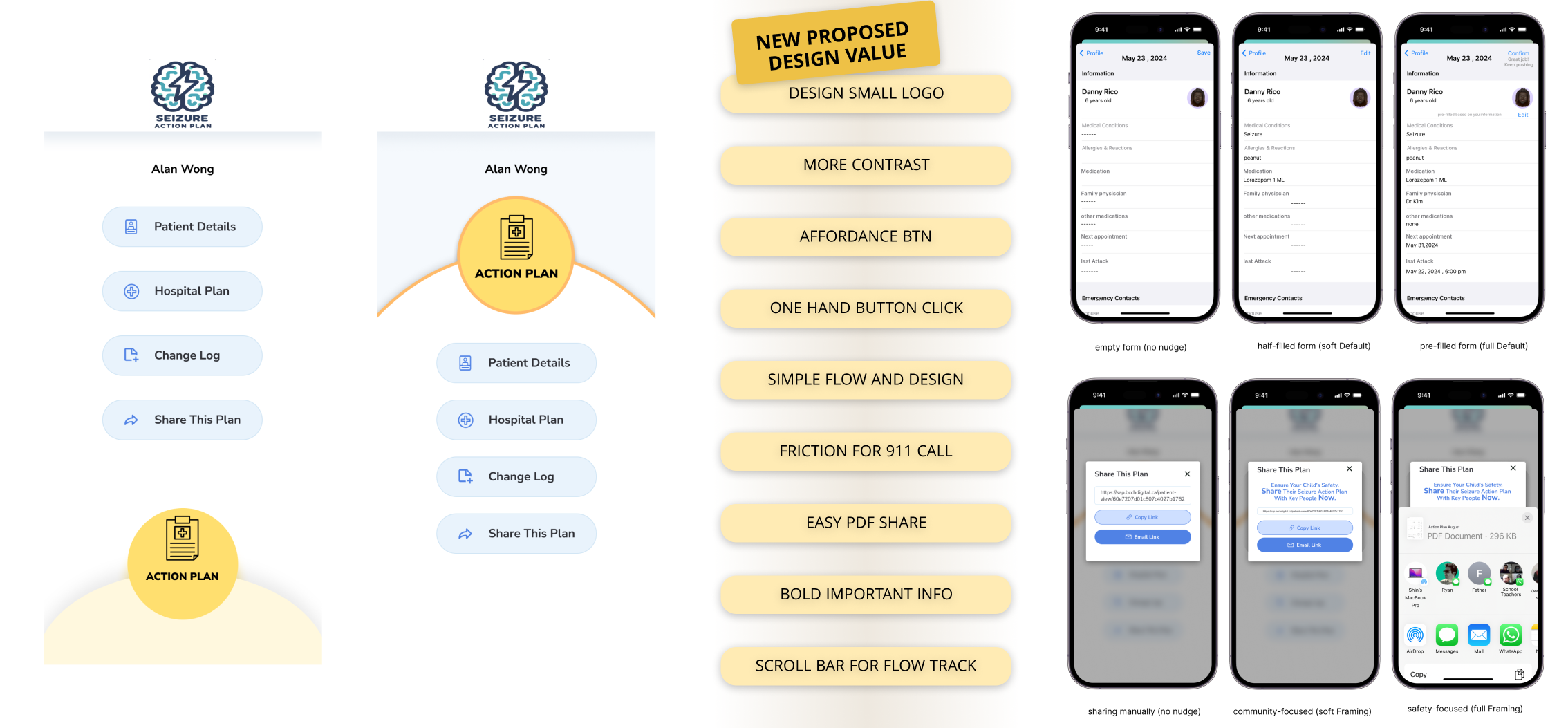
(all proposed value are in green color mapped in figure above and in brain stroming we focused on finding more valuable answer for each problem for eaching the goals).

Eight design versions were developed for comparative testing:
- Color cues and more contrast
- Different call to action button position
- Minimal hierarchy
- New logo design for reduce missclick
- Button shadowe and size change
- Affordance rule follow
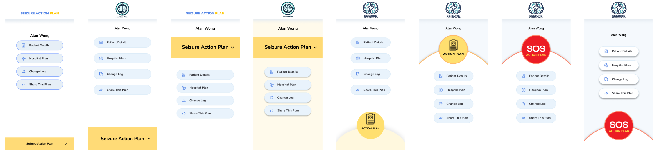
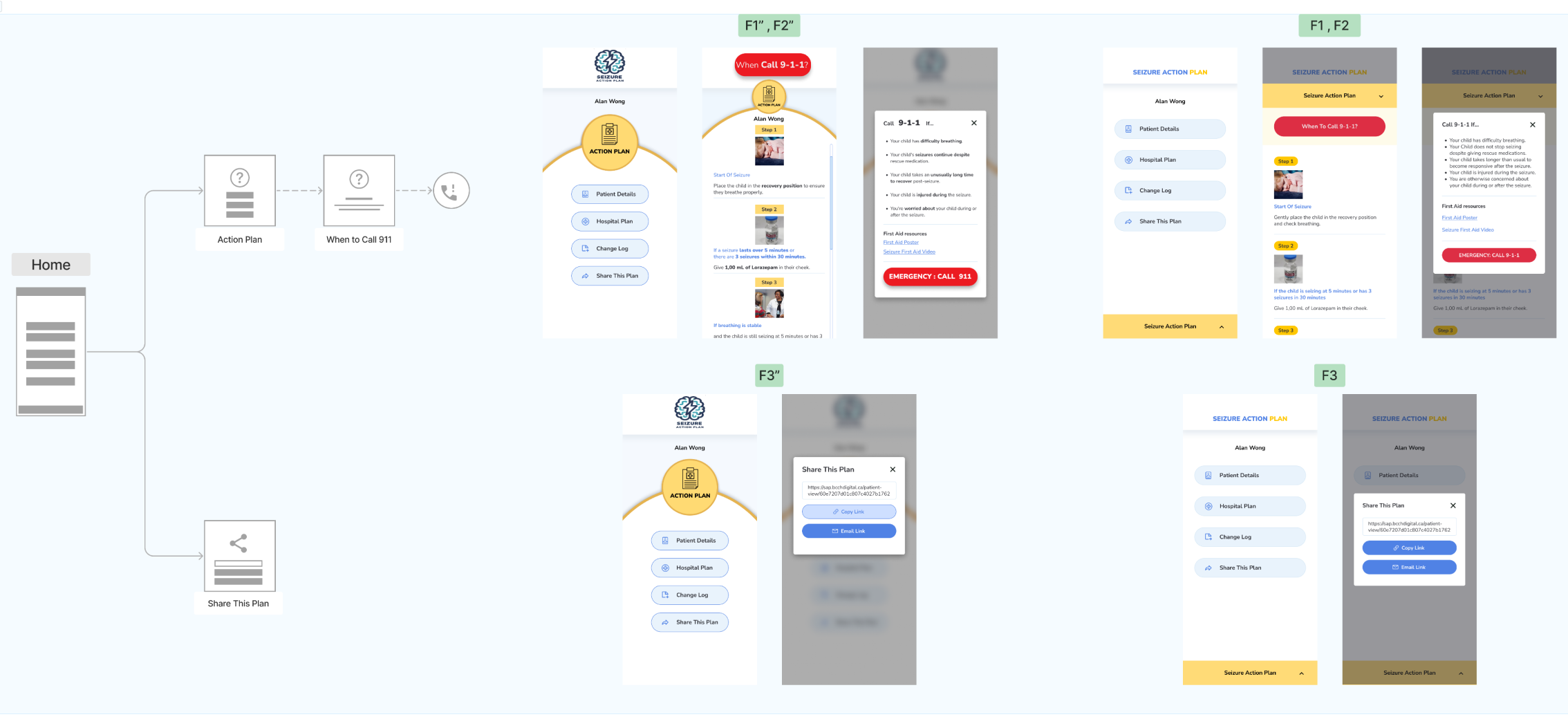
After many review on new designs with the lens of the goals, problem and values , Two design versions were choose and developed for comparative testing.
Phase 5 : User Testing (Maze)
To evaluate behavior and comprehension, both versions were tested with 250 participants (caregivers and general users simulating caregiver roles).
Testing Goals
- Measure time-to-CTA and reading duration for personalized plan data.
- Observe task success under time constraints.
- Analyze error rates and cognitive detours (e.g., incorrect 911 calls).
Results
- Average reading time reduced significantly, improving response speed.
- Fewer unnecessary 911 calls reported in follow-up analysis.
- Version B achieved higher comprehension and faster task completion.
- Caregivers reported greater confidence in following the plan accurately.
Phase 6 : Refinement & Next Steps
Post-testing, the design evolved into a value-centric system emphasizing readability, safety, and personalization.
Upcoming Enhancements
- Digital Nudges: Subtle prompts to sustain user attention and guide dual-system thinking (e.g., color feedback, defaults for high-stress actions).
- Default Settings: Pre-filled thresholds to reduce decision-making time.
- Contextual cues: Visual reinforcements that help caregivers verify correctness under stress
- Behavioral analytics: Future tracking of task flow and dwell time.
Measured & Projected Impact
Reading time for action plan
Before: ~45 sec
Aftre: ~25 sec
Change: ↓ 44 %
Unnecessary 911 calls
Before: High frequency
Aftre: Significantly reduced
Change: ↓ 35 % (pilot phase)
Task success (open plan quickly)
Before: 58 %
Aftre: 91 %
Change: ↑ 33 pts
Reflection
This project demonstrated how value-centric research and behavioral design thinking can align institutional and user priorities. By connecting clinical safety, UX accessibility, and decision psychology, the SAP redesign turned a static medical document into a responsive digital tool for life-saving care.