CATT: From Data to Direction
A Data-Driven UX Research and Design Strategy for a National Health Education Platform
About the Project
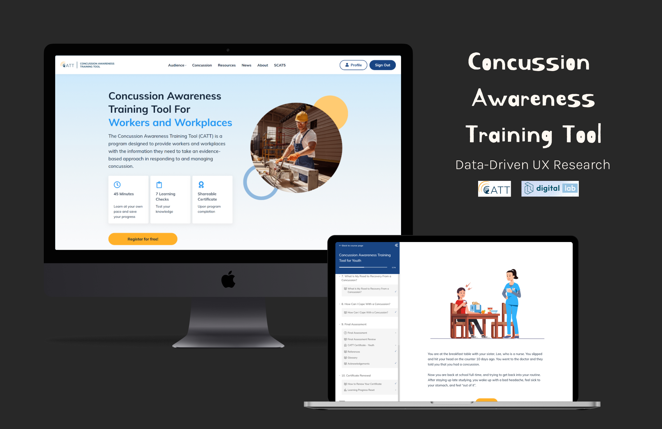
CATT (Concussion Awareness Training Tool) is a national public health education platform offering free, evidence-based modules and resources to improve concussion prevention and management across Canada.
It serves educators, coaches, healthcare professionals, parents, and youth—each with distinct learning needs, digital habits, and motivations.
The Digital Lab partnered with CATT to conduct a comprehensive UX audit aimed at uncovering how users interact with learning content, where they drop off, and how the experience could be restructured for clarity and engagement.
Before diving into design decisions, I established a structured research and analysis workflow to connect data insights with design reasoning.
Challenge
Although CATT reached thousands of users monthly, few completed the training modules. The platform was informative but not behaviorally engaging—users lacked clear direction, progress visibility, and motivation.
🔻Research Question
How might we transform CATT's learning experience into a clearer, more engaging, and data-informed design journey?
🔻 Key Questions
- How do different user groups navigate the platform?
- Where do users drop off in the learning journey?
- What barriers prevent completion of educational modules?
- How can we restructure content for better clarity and engagement?
🔻Scope of This Case Study
Focuses on research, UX audit, and ideation stages.
Testing and redesign implementation are planned next.
Phase 1: Research
Understanding Context and Defining Success
The research phase focused on defining the objectives, audiences, and performance metrics that would guide the UX audit. Activities included:
- Reviewed CATT's learning structure on the LearnWorlds platform (module organization, course completion logic, and assessments).
- Conducted stakeholder interviews with content managers and public health collaborators to identify user goals and known pain points.
- Defined KPIs and benchmarks using Databox industry data and ranges (education & health sectors):
- Page views and top exit pages
- Bounce and engagement rates
- Funnel drop-off and behavioral flow
- Returning vs. new user retention
Outcome: A shared understanding of success criteria and measurable UX health indicators to evaluate the platform.
Phase 2: Audit
Measuring the Experience
With KPIs in place, the audit phase examined real user behavior through data analytics.
Data Collection
- Set up Google Tag Manager (GTM) to capture key events such as button clicks and module completions.
- Conducted a 3-month GA4 audit to observe patterns in user behavior.
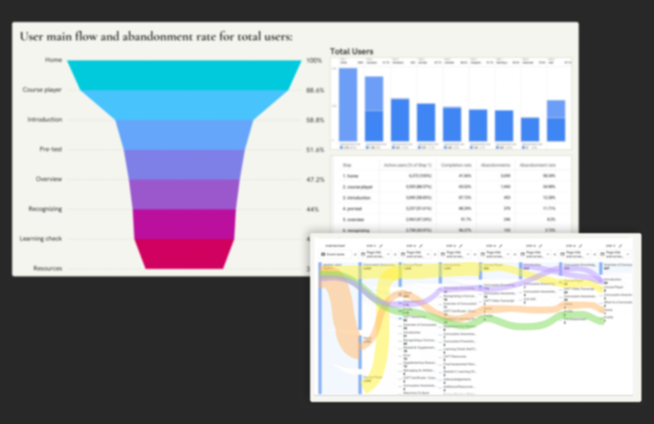
- Validated data for completeness and accuracy. (Figure is bullured for company data privacy).
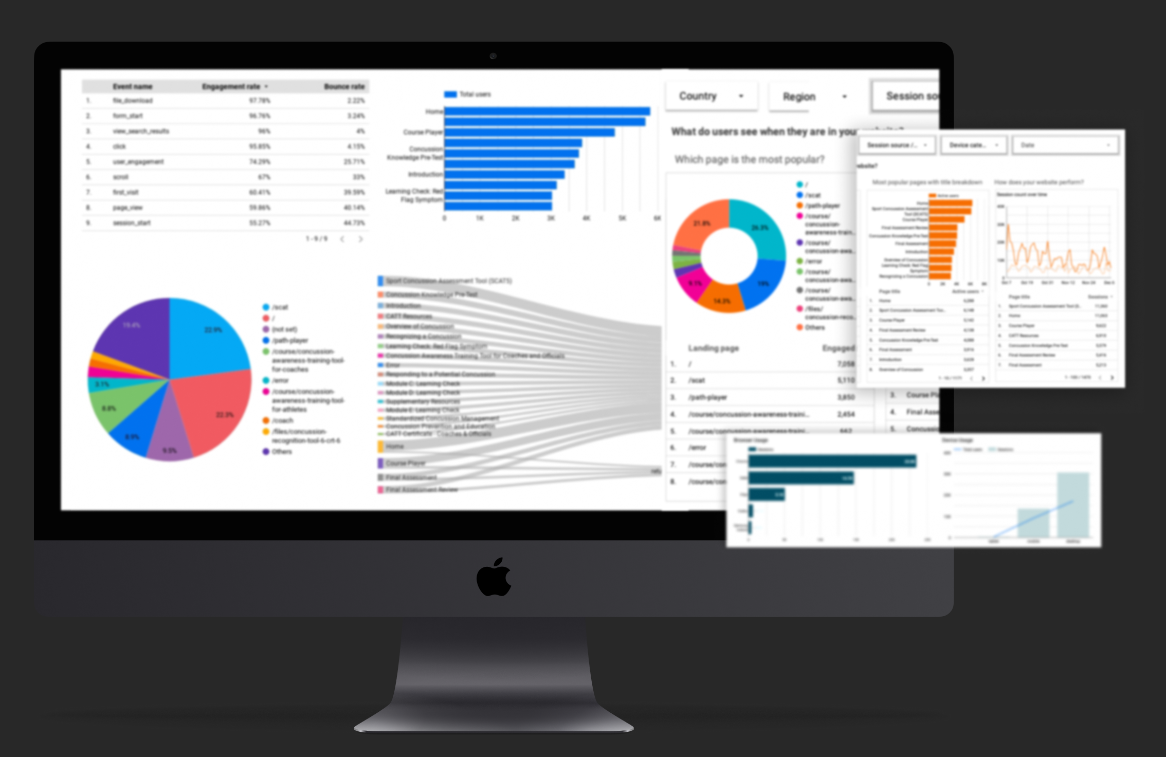
📊 Key Findings:
- 63.7% desktop users (46% Chrome, 38% Safari) → inconsistent responsive behavior
- 42% of users dropped after homepage → weak call-to-action hierarchy
- High bounce on SCAT page → missing back navigation
- Broken links → multiple 404 error interruptions
- Main journey: Home → Resources → Module → Exit → few returns
- Top articles drew traffic but failed to convert to learning module visits.
Phase 3: Insight Synthesis
Finding Meaning in Data
This phase connected data patterns with human behaviors to understand why users disengage. It merged quantitative analytics with qualitative interpretation and stakeholder feedback.
Analysis & Mapping
- Compared CATT performance against Databox benchmarks to contextualize findings.
- Segmented user behavior into four data-driven personas
- Identified emotional and cognitive friction across the journey: unclear start points, lack of guidance, and missing feedback loops.
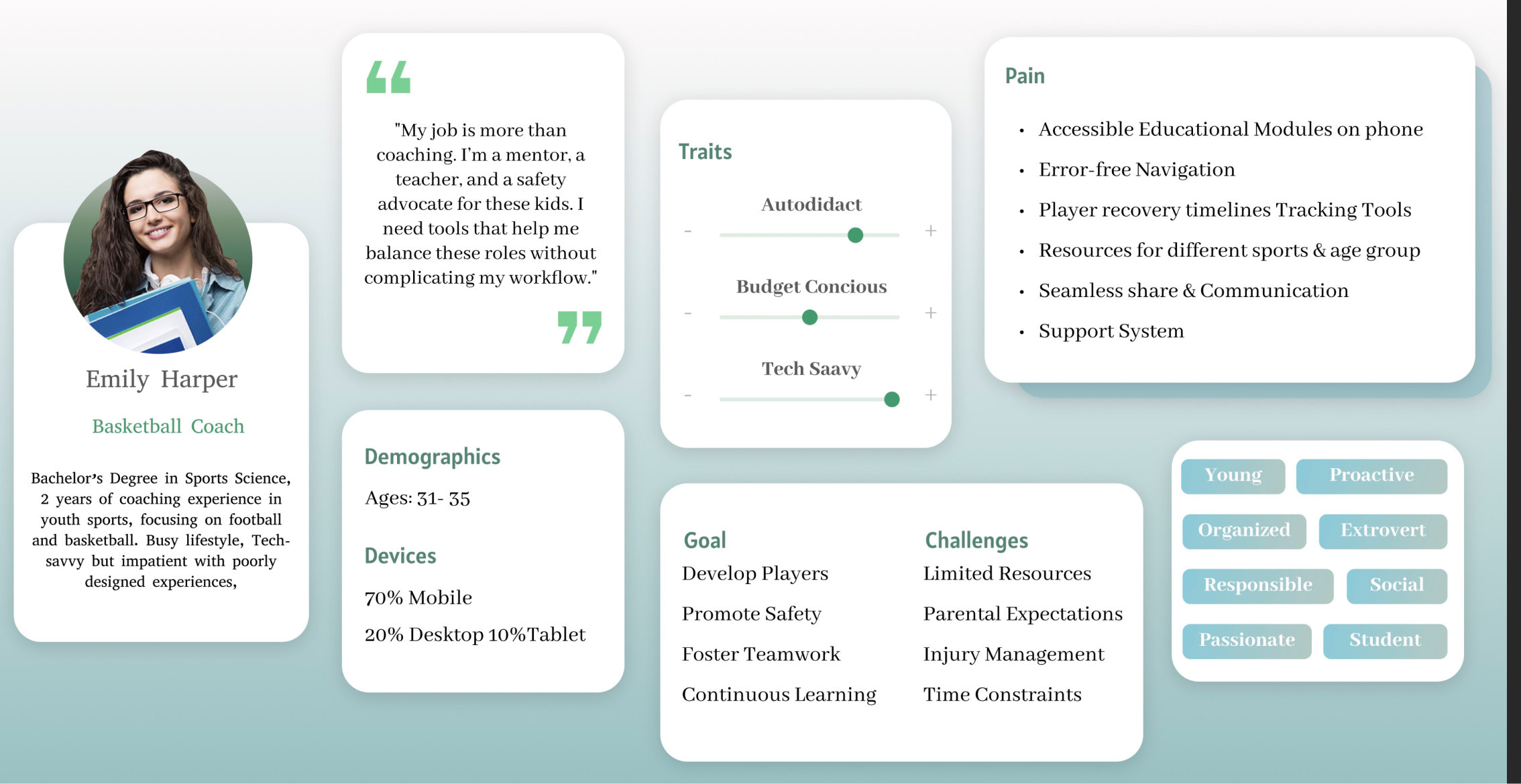
Main Personas
- Educator
- Coach
- Healthcare Professional
- Youth Learner
Thematic Insights
Synthesis of research and analytics findings into actionable design direction.
| Theme | Finding | Implication |
|---|---|---|
| Access | Users struggled to locate training modules quickly; 42% exited after the homepage. | Simplify information architecture and surface clear homepage CTAs (2‑click rule to modules). |
| Continuity | Broken links and missing back navigation (e.g., SCAT) disrupted task flow and reduced trust. | Repair link structure, add breadcrumbs/back paths, and provide recovery options on 404 pages. |
| Motivation | Lack of visible progress and feedback lowered commitment to complete modules, especially on mobile. | Introduce progress indicators, milestones, and contextual prompts within scroll to maintain momentum. |
*Themes derived from GA4 audit (3 months), LearnWorlds review, Databox benchmarks, and stakeholder interviews.
Outcome: A clear understanding of the cognitive and structural barriers limiting user engagement.
Phase 4: Ideation
Translating Insights into Design Direction
Building on the research and audit findings, I defined strategic design opportunities to improve learning continuity and motivation.
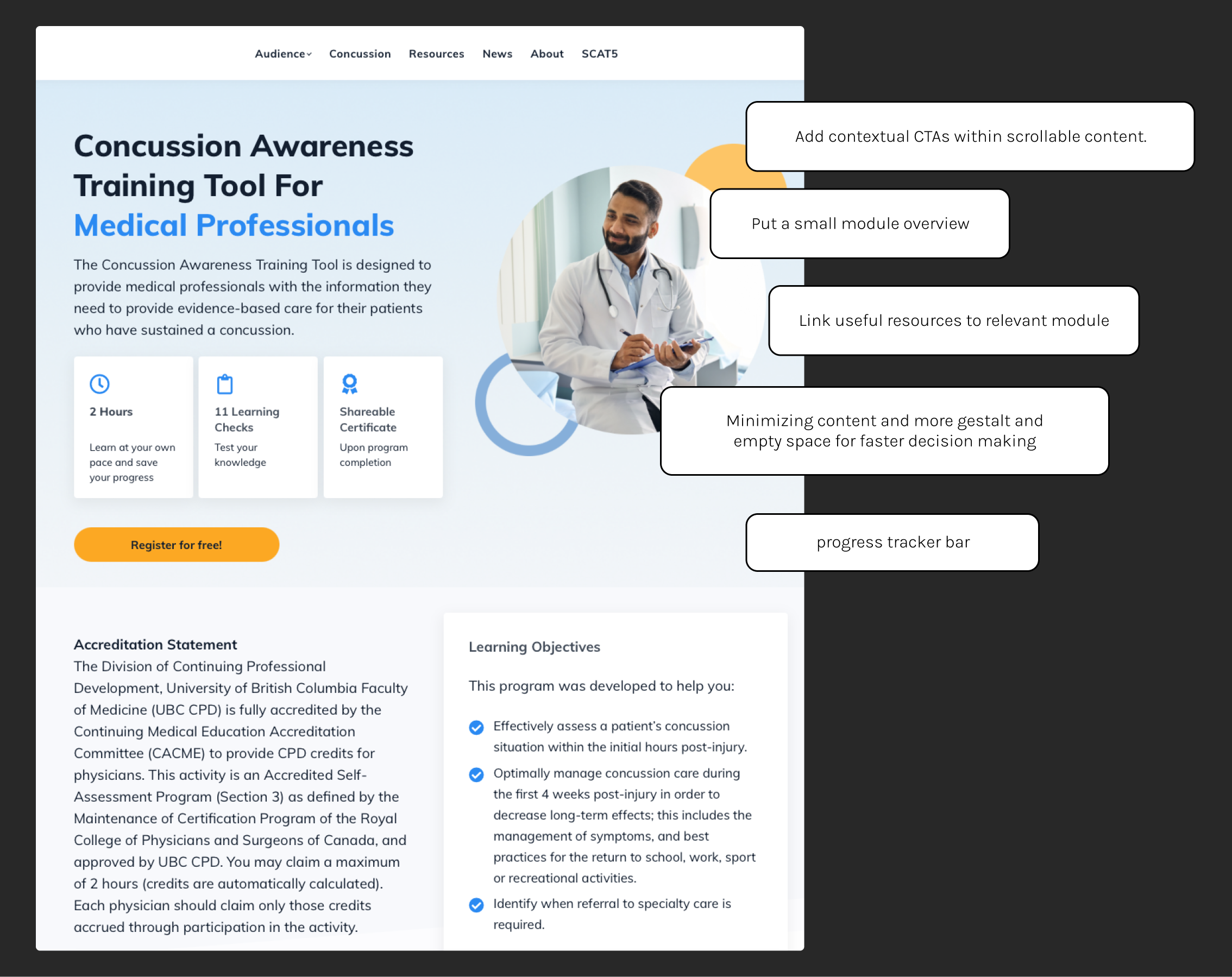
Key Design Opportunities
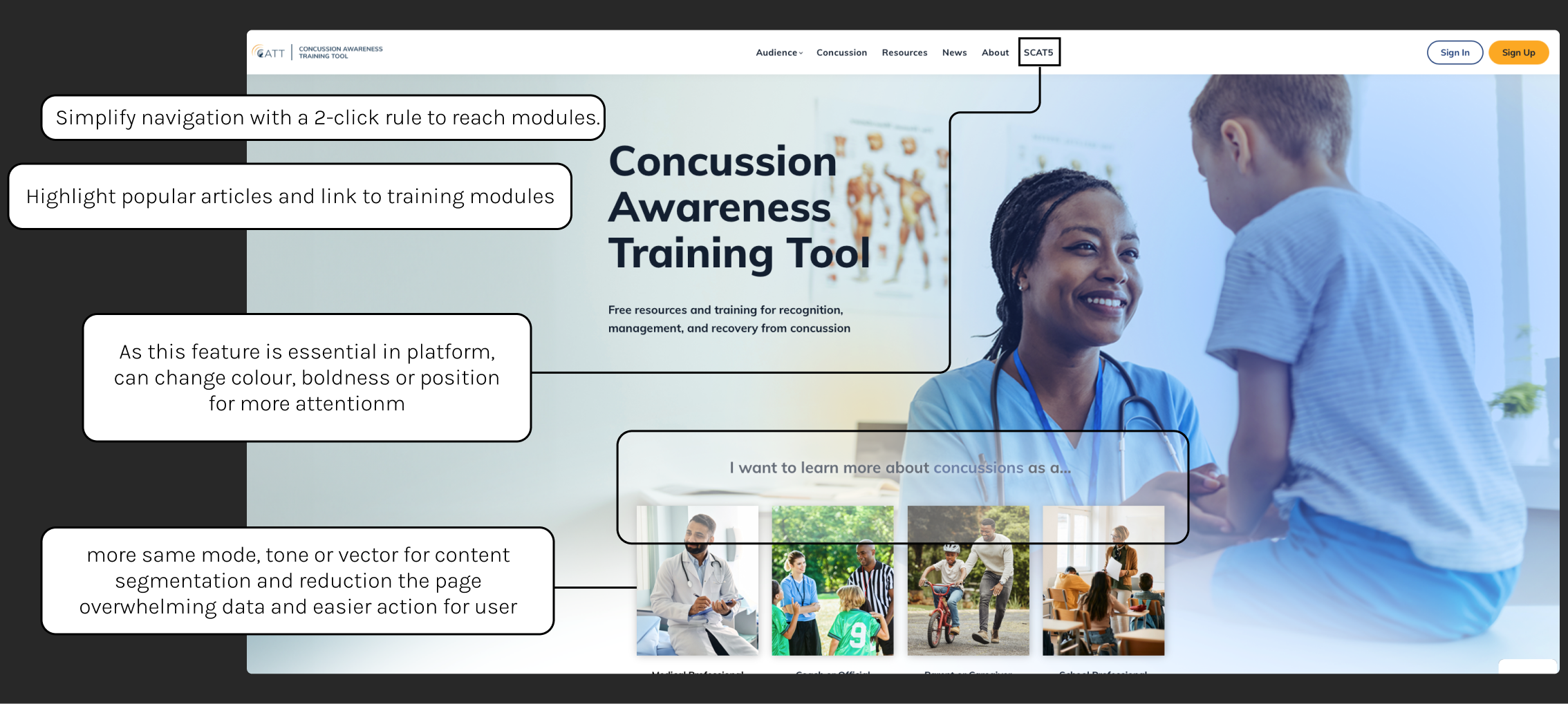
- Apply a 2-click rule for users to reach training modules.
- Introduce visible learning progress indicators (completion bar, badges).
- Redesign navigation based on audience intent (“I'm a Coach / I'm an Educator”).
- Embed contextual CTAs within content scroll rather than static top nav.
- Repair all broken links and add a global search bar to error pages.
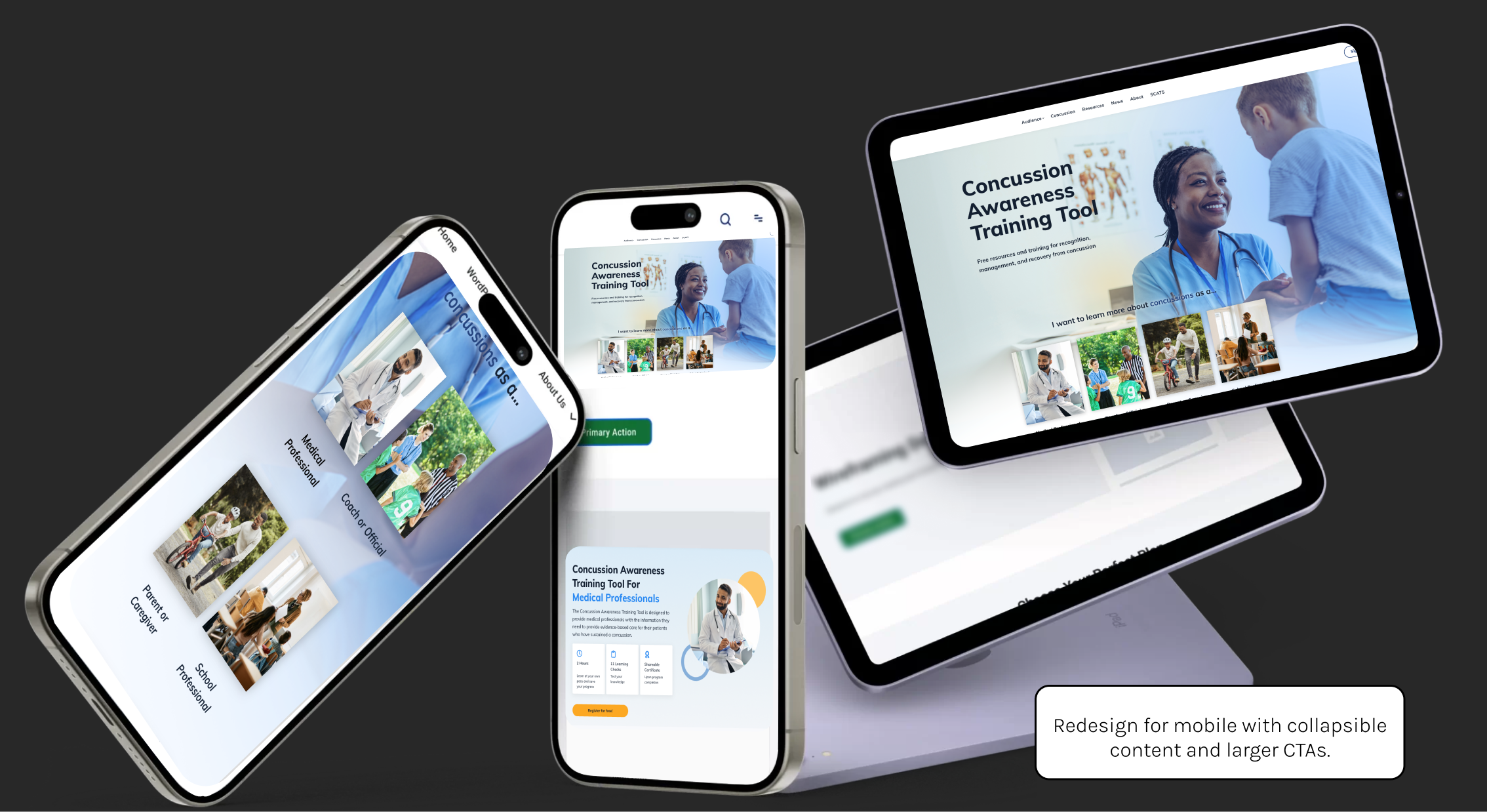
- Optimize mobile UX with collapsible sections and larger CTAs.
- Link popular articles directly to related modules to guide users organically.
Next Steps (Planned)
The project concluded with a research-backed ideation phase. Planned next steps include:
- Usability testing with educators, youth, and coaches.
- Hotjar heatmaps & session recordings.
- A/B testing of navigation flows.
- Tracking new KPIs post-redesign.
Deliverables & Process
The project deliverables included comprehensive research documentation, design recommendations, and strategic insights:
Strategic Clarity
Defined measurable UX objectives aligned with engagement goals.
Design Readiness
Delivered structured, evidence-based recommendations for redesign.
Operational Value
Established GA4 + GTM system for accurate future tracking.
Cross-Team Collaboration
Created a shared data language between analytics, design, and content teams.
Reflection
This case study demonstrated how data interpretation can drive empathy-centered design. By connecting user behavior metrics with human motivations, CATT gained a clear direction for its next redesign.
“Data without design intent lacks direction , but design without data lacks truth.”
Data explains what users do; research reveals why.
Benchmarks provide context for prioritizing UX improvements.
Insight synthesis bridges analytics and design thinking.