UX/UI Design · Website Redesign · Dance Studio
Stage Door
Dance
Enhancing user satisfaction, usability, and completion rate for a dance studio website — from 68% bounce rate to 62% registration growth.
62%
Registration completion ↑
2×
Trial class sign-ups
4.6
Satisfaction score / 5
00
Project at a Glance
Client
Stage Door Dance
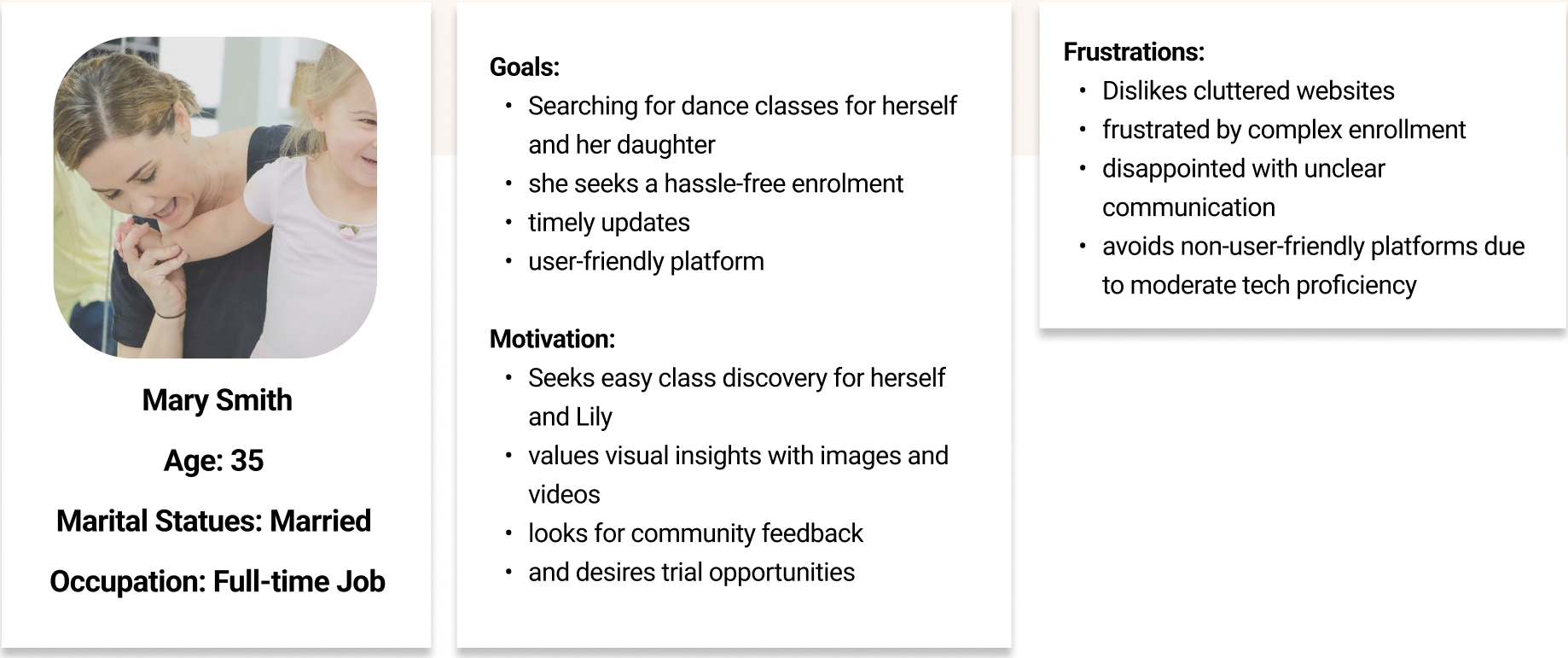
A premier dance studio offering classes for all ages and skill levels — needing a website that matched their energetic community.
Problem
Fragmented Experience
The site had grown through fragmented additions — cluttered layouts, unclear navigation, and inconsistent structure causing high drop-off.
Goal
Clear Discovery & Registration
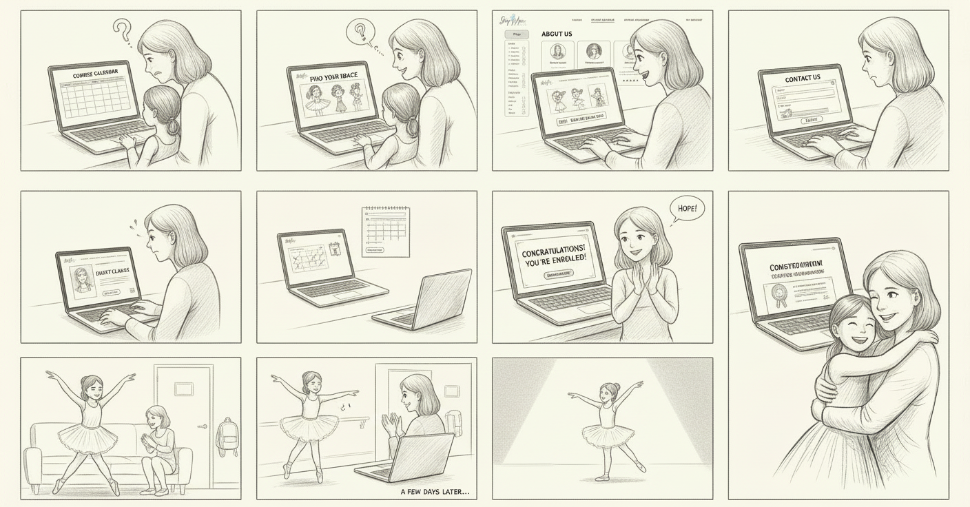
Improve navigation, modernize the experience, and support clearer class discovery and registration for dancers and parents.
Method
Research-Led Redesign
Heuristic evaluation, surveys, interviews, card sorting, and two rounds of Maze usability testing — before any pixel was placed.
→
My Role
UX Research
Heuristic evaluation and in-depth user interviews.
IA & Card Sorting
Open card sorting to restructure information architecture.
Wireframing
Mid-fidelity wireframes and interaction design in Figma.
Prototyping & Testing
Interactive prototypes tested via two rounds of Maze.
Visual Refresh
Component design and visual system aligned to brand energy.
01
Discovery & Research
Research methods
Heuristic evaluation — 35+ usability issues identified
Surveys — 58 responses collected
Interviews — 12 users in depth
Competitive benchmarking of dance & fitness platforms
Affinity mapping → pain-point clusters
The site had grown through fragmented additions — users felt lost before they ever found a class.
02
Key Findings
📉
68% Bounce Rate
Users left before completing any action — registration flow was invisible and confusing.
🗺
Confusing Navigation
Complex structure, unclear hierarchy, and repetitive content made finding class schedules a challenge.
📱
Poor Mobile Experience
65% of traffic came from mobile — but the experience was desktop-first and visually broken on small screens.
🎨
Brand Misalignment
Outdated visuals didn't reflect the studio's energetic, vibrant identity — first impressions were failing.
🔔
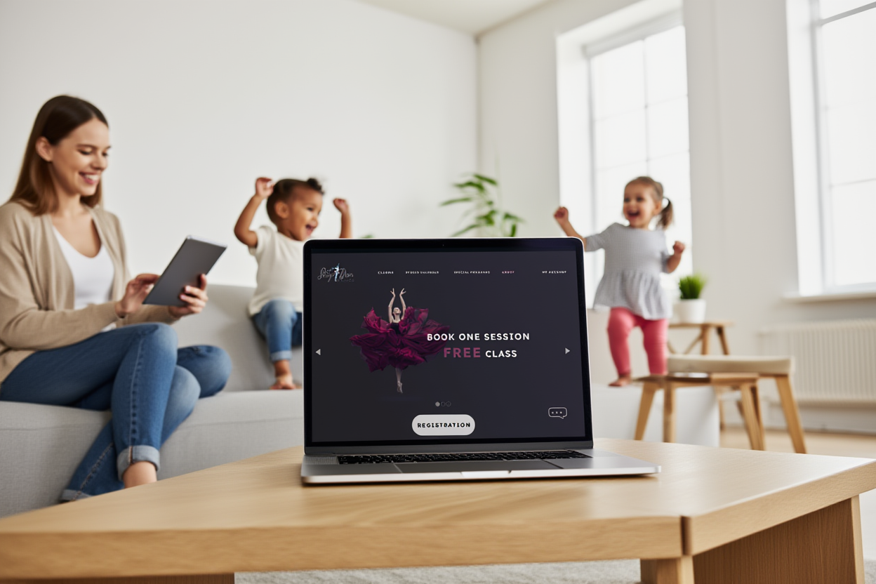
No Clear CTA
Missing feedback during registration and no prominent trial class sign-up path — users didn't know what to do next.
35+ Heuristic Issues
68% Bounce Rate
65% Mobile Traffic
No Trial CTA
Affinity Mapped
03
Ideation & Design
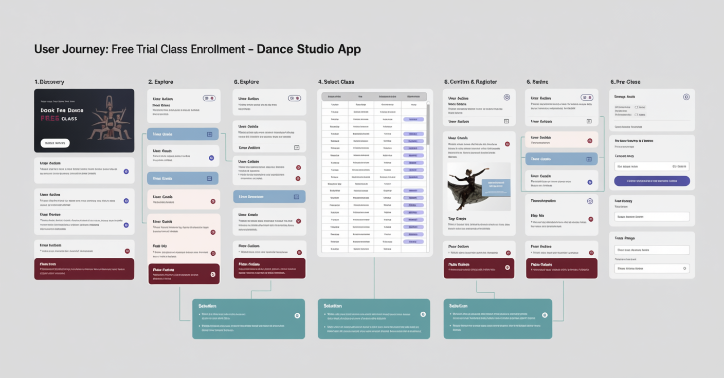
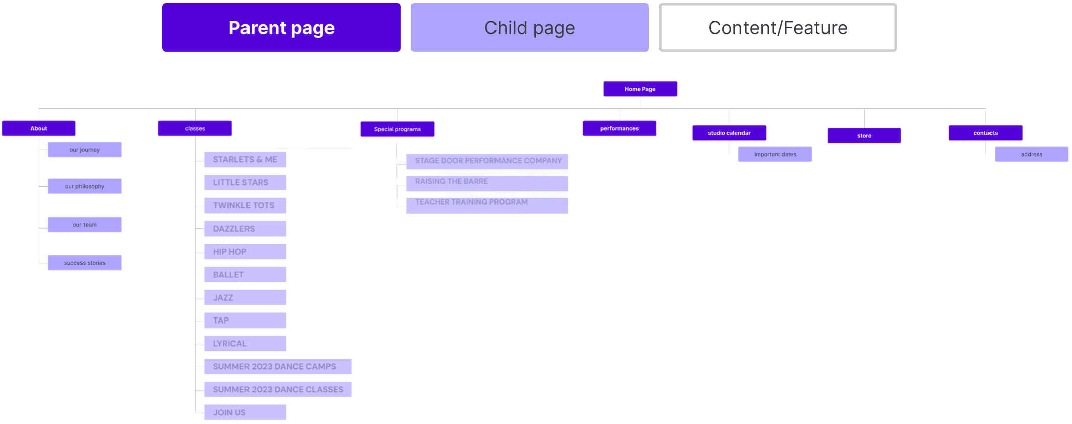
Open card sorting revealed how users naturally grouped content — this directly restructured the information architecture before any wireframe was drawn.
IA Restructure
Card Sorting
Users grouped content naturally — results directly restructured the navigation to match mental models, not site history.
Navigation
Simplified Structure
Reduced navigation depth, eliminated duplicate content paths, and surfaced class schedules within 2 clicks.
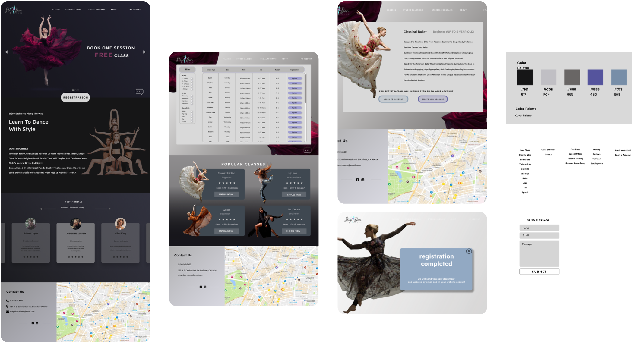
CTA Design
Clear Hierarchy
Trial class sign-up made the primary CTA on every key page — supported by visual grouping and consistent feedback states.
04
Prototyping & Testing
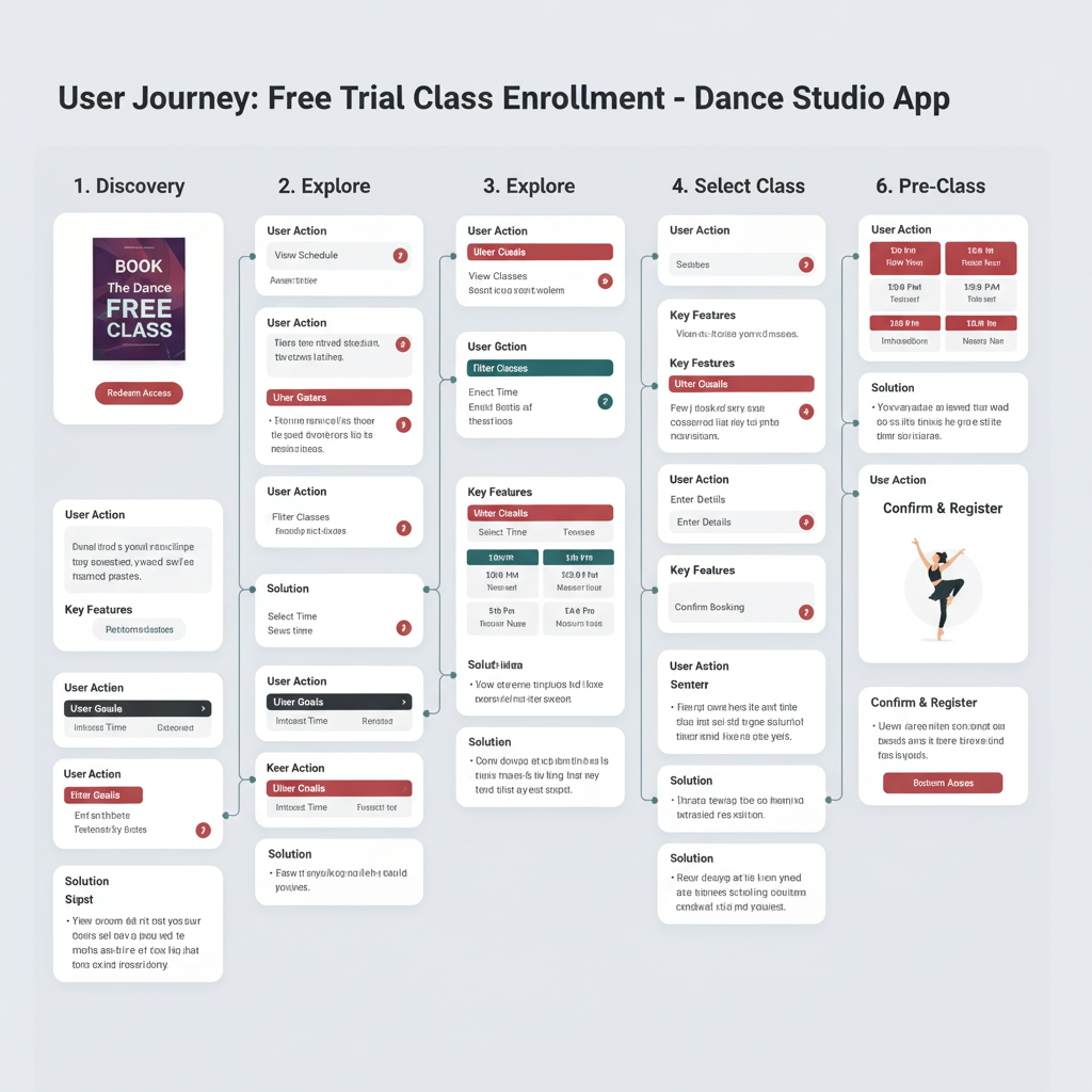
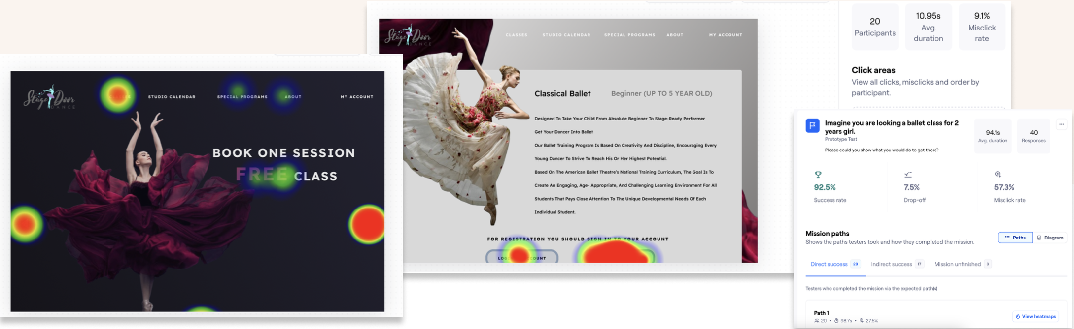
Two rounds of remote usability testing via Maze — each round refining the registration flow and navigation structure before final delivery.
100%
Task completion — new registration flow
83%
Rated filtering "easy" or "very easy"
~40%
Task time improvement
4.6/5
Overall satisfaction score
Deliverables: prototype, component library, annotated flows, and responsive UI
Scalable IA established as a foundation for future development
Research-led decisions documented for handoff to development team
05
Impact & Results
62%
Increase in registration completion rate
−12%
Reduction in bounce rate
2×
Increase in trial class sign-ups
"
The new website has transformed how we connect with our community. We've seen a significant increase in new student registrations and parents love how easy it is to find information.
— Studio Owner, Stage Door Dance
"
The best redesigns don't feel like redesigns — they feel like the site finally works the way it always should have.
Card sorting before wireframing — letting real user mental models drive the IA meant zero navigation rework after testing
Mobile-first from the start — with 65% mobile traffic, every layout decision was made at 375px first and scaled up
One clear CTA per page — removing competing actions doubled trial sign-ups without changing any content