UX Research · Public Health · Canada
CATT: From Data
to Direction
A data-driven UX research strategy for improving engagement and module completion in a national health education platform.
42%
Homepage drop-off
4
Research phases
3mo
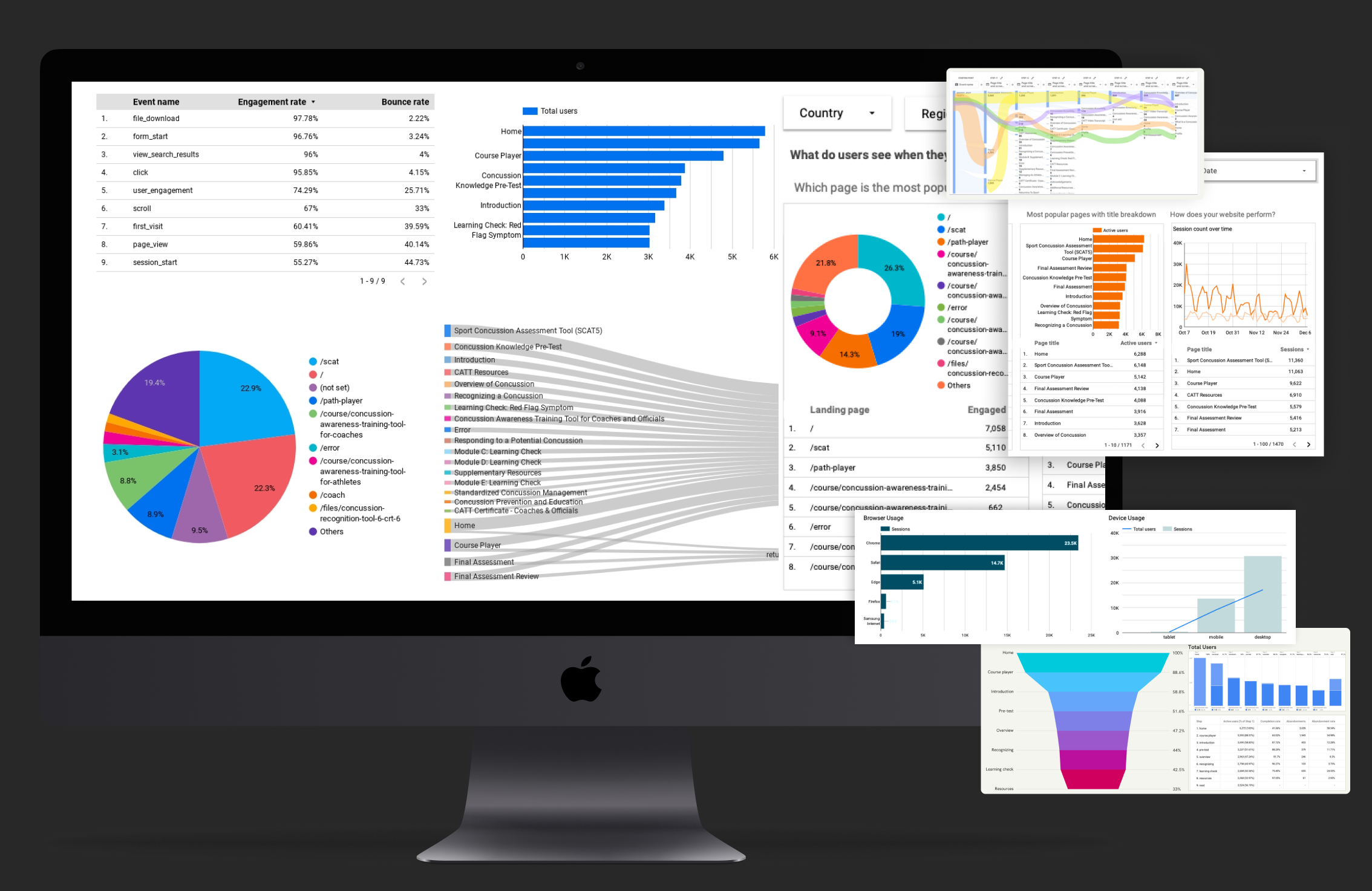
GA4 data analysed
00
Project at a Glance
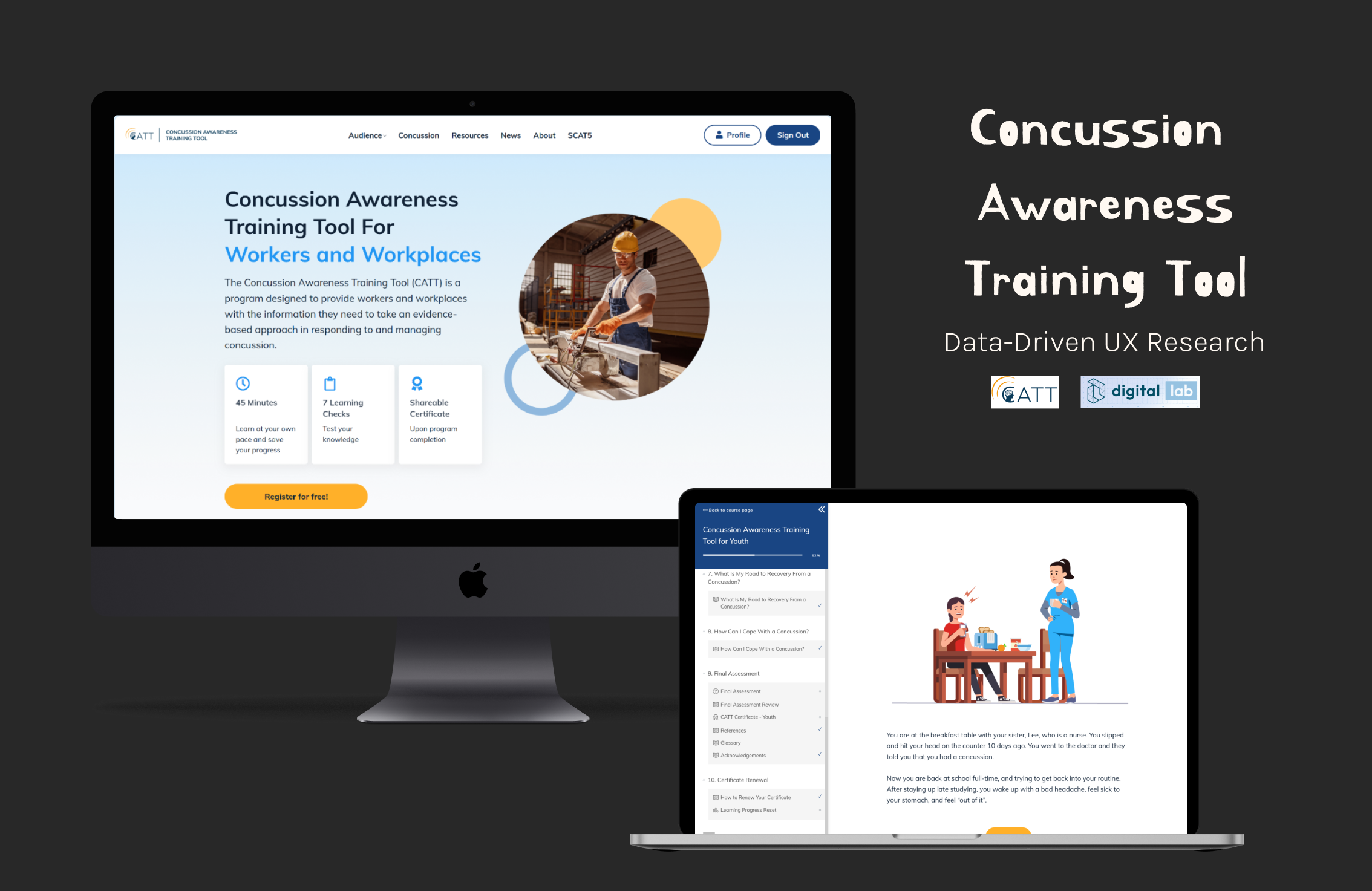
Platform
CATT
National concussion education platform, free across Canada since 2019. Serves educators, coaches, healthcare professionals, parents and youth.
Problem
The Gap
Significant drop-offs across the learning funnel — design assumptions weren't matching real user behaviour.
Method
Mixed Methods
Structured UX research process: planning → mixed-method research → synthesis → actionable product insights.
Outcome
Clear Direction
Broken paths revealed, friction points mapped, design recommendations delivered to product & content stakeholders.
↓
The Challenge
Despite consistently strong traffic, module completion was critically low. The platform informed users — but failed to guide or motivate them to finish.
Analytics revealed a clear mismatch between intended and actual user journeys, pointing to structural UX failures rather than content quality issues.
How might we transform CATT's learning experience into a more engaging, completion-driven journey?
01
Planning
KPI
Definition
Completion rate targets
Engagement benchmarks
Funnel stage metrics
🤝
Stakeholder Alignment
Kickoff workshops
Priority mapping
Scope definition
🔍
Research Design
Mixed-methods plan
Analytics access review
Timeline planning
📋
Requirements
Platform audit
Data source mapping
Gap analysis
02
Research
Data was scattered across platforms — first step was gathering, cleaning, and unifying it before any analysis could begin.
Audited CATT's full course structure and user flow
Interviewed stakeholders and public health partners
Established KPIs using GA4 + Databox benchmarks
Metrics tracked
User Demographics
New vs Returning
Engagement Rate
Session Duration
Funnel Drop-off
Retention
Click-Through Rate
Scroll Depth
Device Usage
03
Synthesis of Findings
⬇
42% Homepage Drop-Off
Weak CTA hierarchy — users had no clear place to start.
🖥
Desktop-Heavy, Mobile-Broken
Inconsistent responsive behaviour frustrated mobile users.
🔗
Broken Navigation Paths
Missing back-navigation left users stranded with no exit.
📰
High-Traffic Dead Ends
Popular articles had no CTAs to pull readers into modules.
👤
2 Core Personas Surfaced
Coaches and Healthcare Professionals — each with distinct drop-off signatures.
42%
dropped off immediately after the homepage
Main personas identified
🏃
Coach
Active returning user
Drop-off pattern
High engagement on homepage, exits at module start
Returns multiple times — signals intent but friction blocks completion
Primary drop-off: Coach Modules page
🩺
Healthcare Professional
Single-session user
Drop-off pattern
Arrives via article content, rarely continues to modules
No contextual CTAs to bridge articles → learning path
Primary drop-off: Homepage → article dead end
Core UX frictions
Unclear starting points — no role-based onboarding or directed entry paths
Broken navigation paths — dead-end pages with no recovery routes
Poor mobile experience — inconsistent layout breakpoints across device sizes
↗
Thematic Insights
| Theme | Design Implication |
|---|---|
|
A · Access Information Architecture |
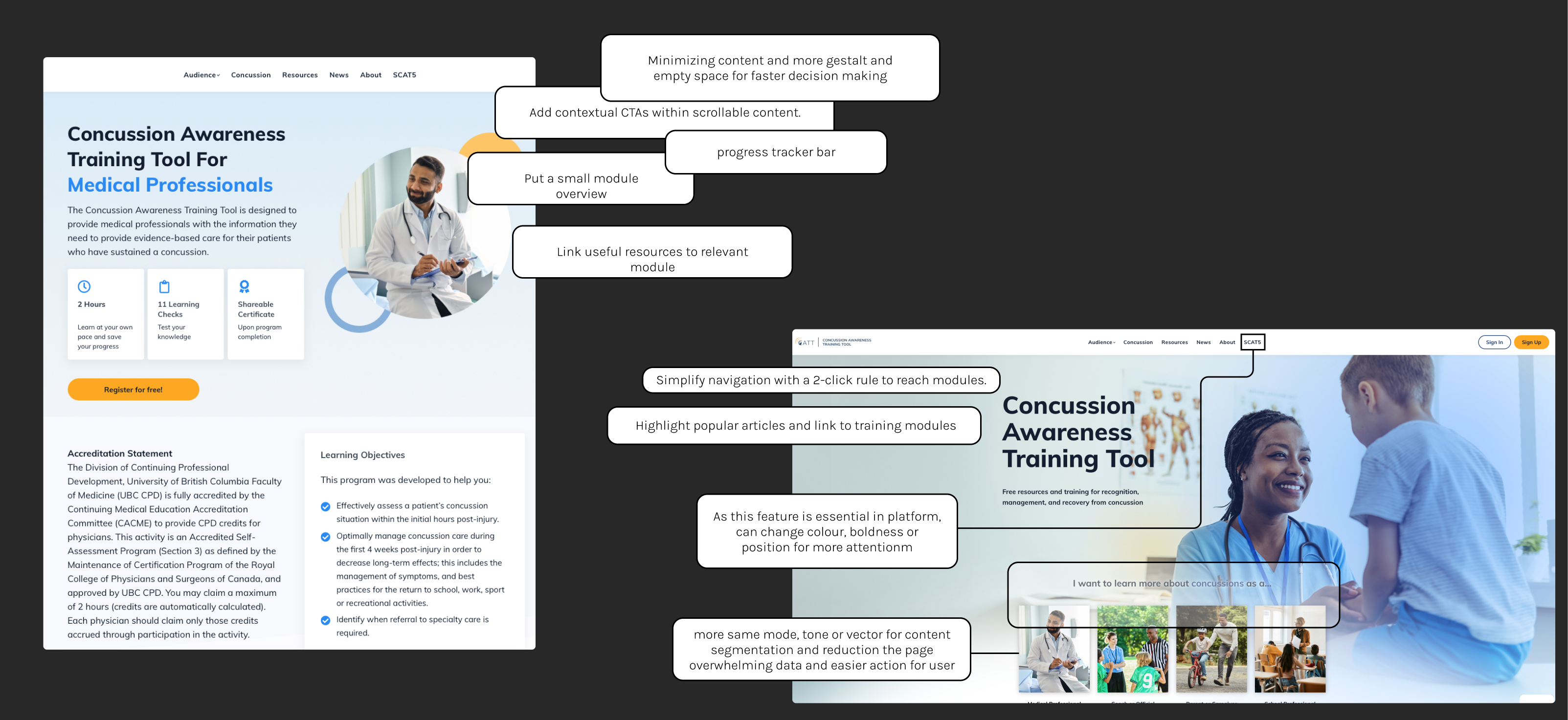
Simplify IA and surface training within 2 clicks. Role-based entry points cut cognitive load and route users directly to relevant modules. |
|
B · Continuity Navigation & Recovery |
Fix broken paths, add breadcrumbs, improve recovery flows. Every page needs a way back and a way forward. |
|
C · Motivation Engagement Design |
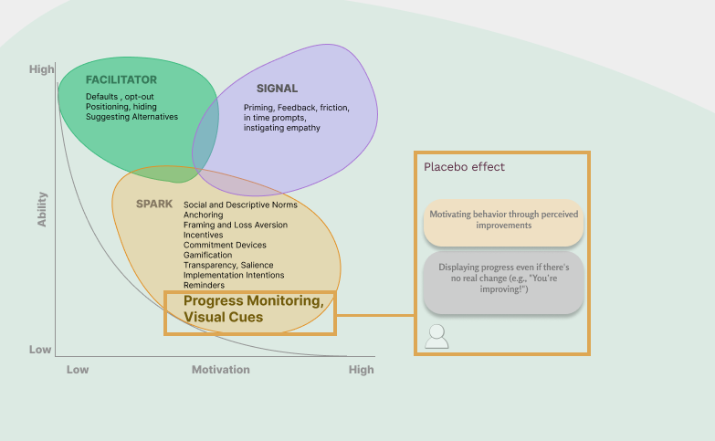
Progress indicators, milestones, and contextual CTAs embedded in content. Visible momentum converts passive readers into active learners. |
04
Design Direction
Fix Broken Navigation
Repair broken links and search bar on error pages. Clear recovery flows — no dead ends.
Search & Filter Overhaul
Redesign search and filter functionality for faster, role-relevant content discovery.
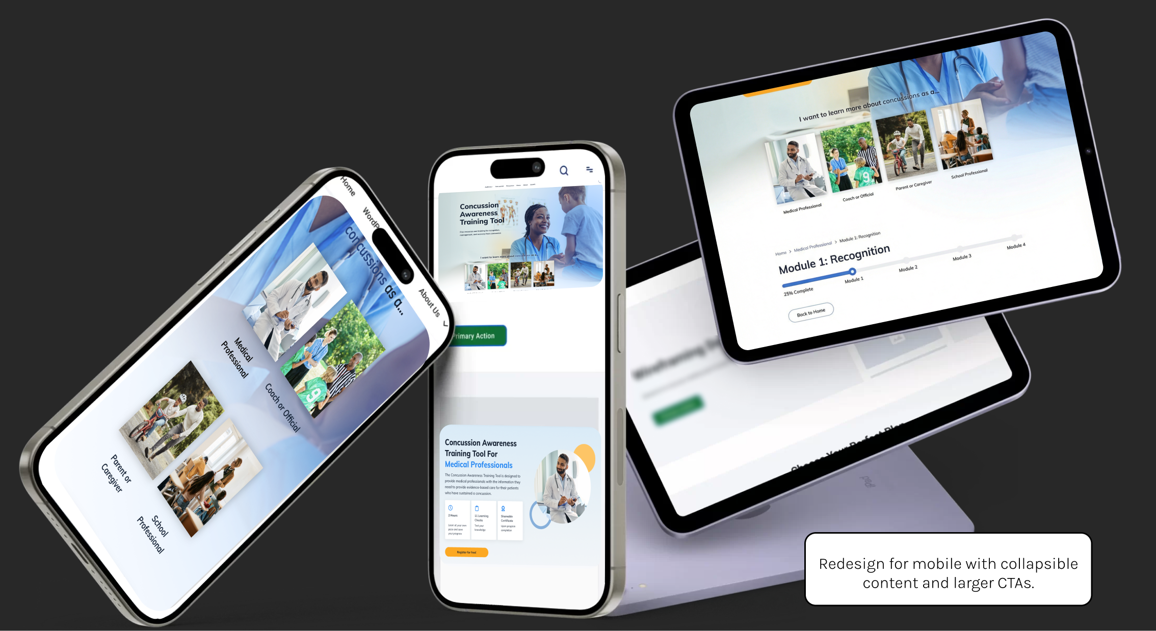
Role-Based Entry
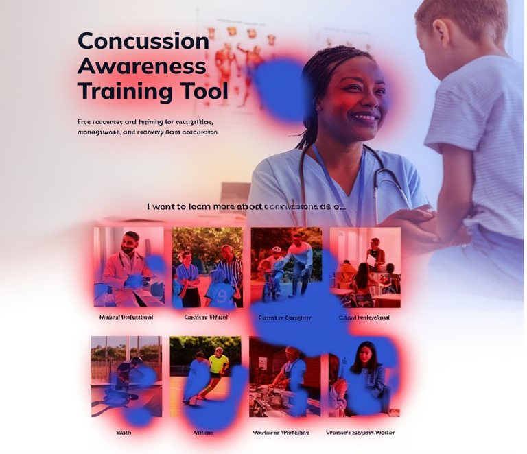
"I'm a Coach / Educator" prompts to route users immediately to relevant modules.
Progress Cues
Visible progress bars and completion milestones to build momentum throughout learning.
Contextual CTAs
Embedded calls-to-action in high-traffic articles — convert readers at peak intent.
Mobile-First
Touch-friendly layouts and clear article → module pathways on small screens.
"
Data without design intent lacks direction — but design without data lacks truth.
Aligned analytics, design, and content teams around shared behavioural insights
Delivered research-backed design direction connecting behaviour metrics to human motivation
Established GA4 + GTM tracking foundation for ongoing data-informed iteration
Before & After — Key Screen Improvements
4 critical pain points identified · 3 design directions tested · navigation & completion flow improved
01 · Homepage — Role-Based Entry & CTA Hierarchy
→
02 · Broken Navigation — 404 Page & Module Flow
→