
UX Research & Design · Pediatric Health · BC Children's Hospital
Seizure
Action Plan
Value-centric UX research and design for rapid pediatric seizure response — when seconds matter most.
44%
Faster reading time
35%
Fewer unnecessary 911 calls
91%
Task success rate
00
About the Project
Platform
SAP Mobile App
A mobile health app that securely hosts patient-specific seizure action plans for BC Children's Hospital patients.
Users
Caregivers, Educators & Clinicians
Three distinct roles who need fast, accurate access to a child's care plan — anytime, anywhere.
Problem
Seconds Matter
Complex, text-heavy layouts delayed comprehension of urgent steps — leading to unnecessary 911 calls.
Method
Value-Centric Design
Assigned numerical importance weights to features, aligning clinical safety goals with caregiver needs.
→
Design Process Overview
| Phase | Focus | Key Outcome |
|---|---|---|
| Planning 01 |
Page & flow mapping, feature inventory, defining goals | Structured product map & prioritized evaluation plan |
| Research 02 |
Stakeholder and caregiver interviews, heuristic review | Pain points in readability & decision-making speed |
| Prioritization 03 |
Assigning importance weights to features | Aligned user and stakeholder goals (BCCH & caregivers) |
| Ideation 04 |
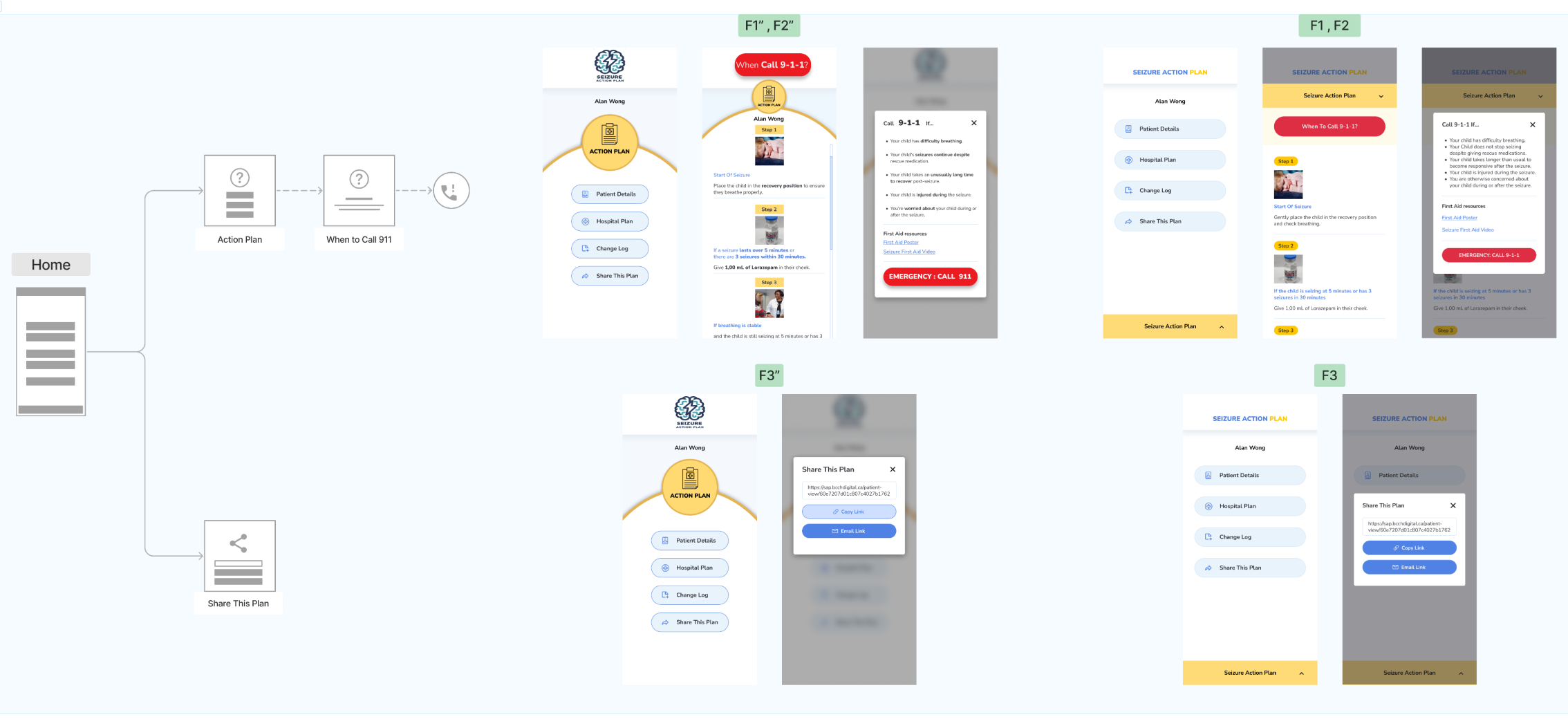
UX redesign of the Action Plan Flow | Eight versions developed → two selected for testing |
| Testing 05 |
Behavioral A/B testing via Maze (50 users) | Reduced reading time & unnecessary 911 calls |
| Future 06 |
Digital nudges & decision support | Improved focus and reduced task friction |
01
Planning & Product Mapping
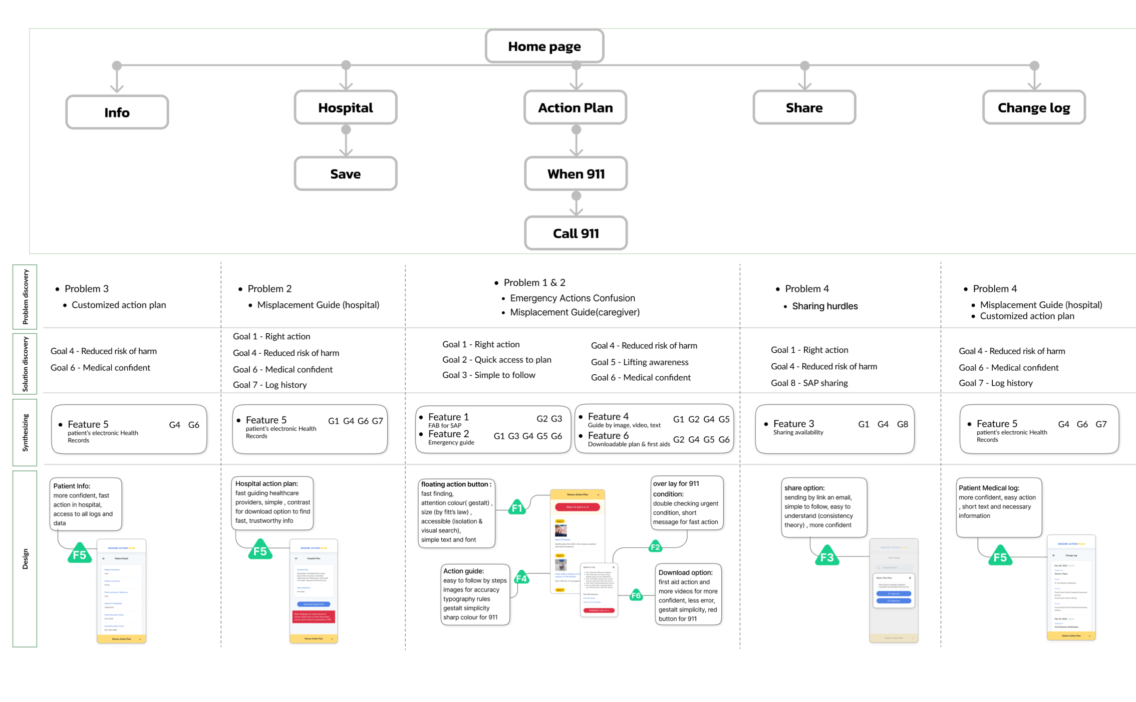
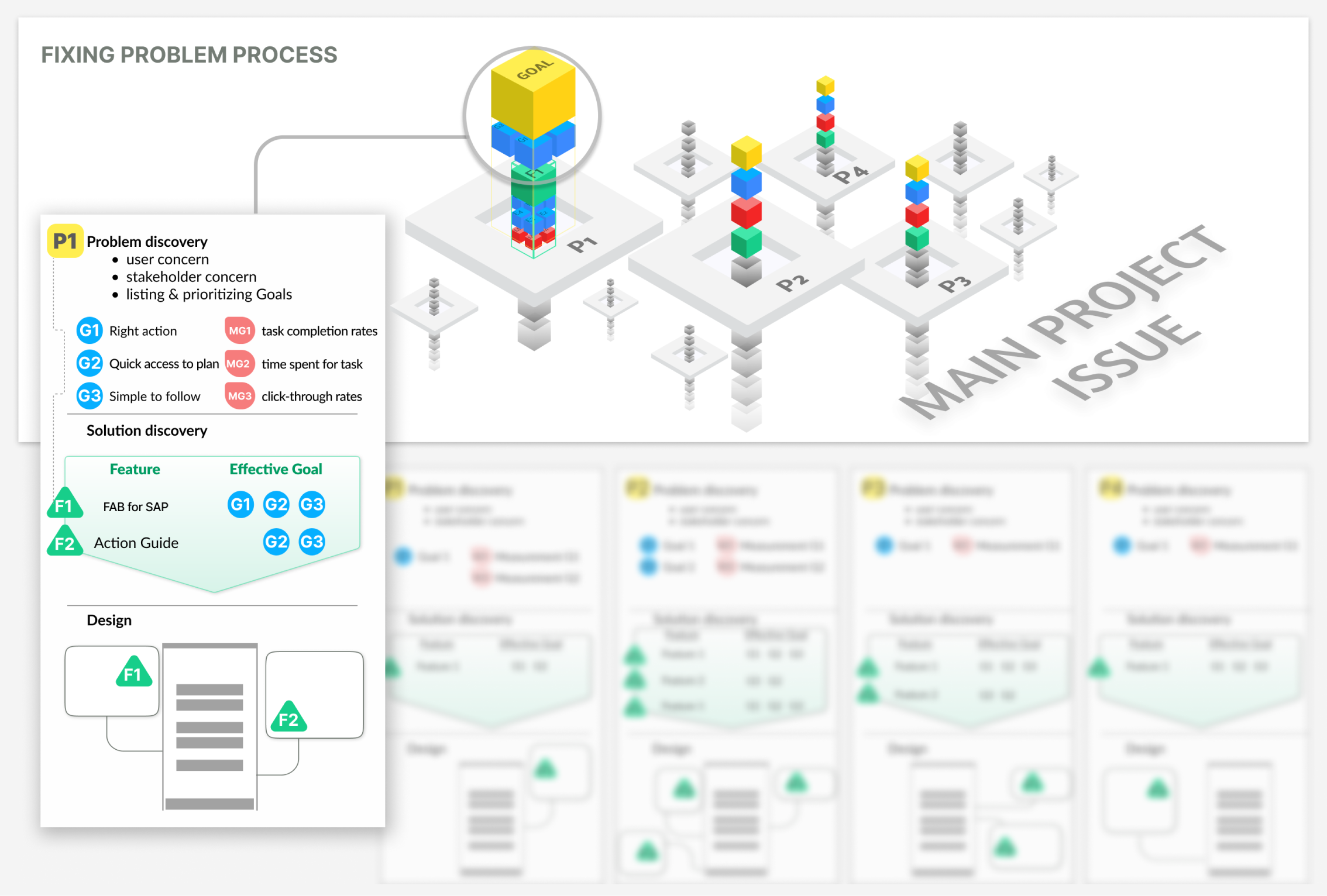
Systematic mapping of all pages, user flows, and app structure — every feature listed with its intended purpose before any design decisions were made.
A value hierarchy assigned numerical weights to each goal based on clinical and user significance.
Primary user goal: access, understand, and act on the child's seizure plan — and call 911 only when necessary.
🗺
Complete Application Sitemap
Full feature list with purpose and priority level for every screen.
👤
Role-Based User Journeys
Mapped flows for clinicians, caregivers, and educators — three distinct mental models.
⚖️
Value Hierarchy Framework
Numerical weights assigned to each goal by clinical significance and time-sensitivity.
Speed
Readability
Safety
Clarity
Personalization
Accessibility
02
Research & Audit
Interviewed 20 caregivers to surface real concerns, mental models, and needs. Findings clustered via affinity mapping.
📖
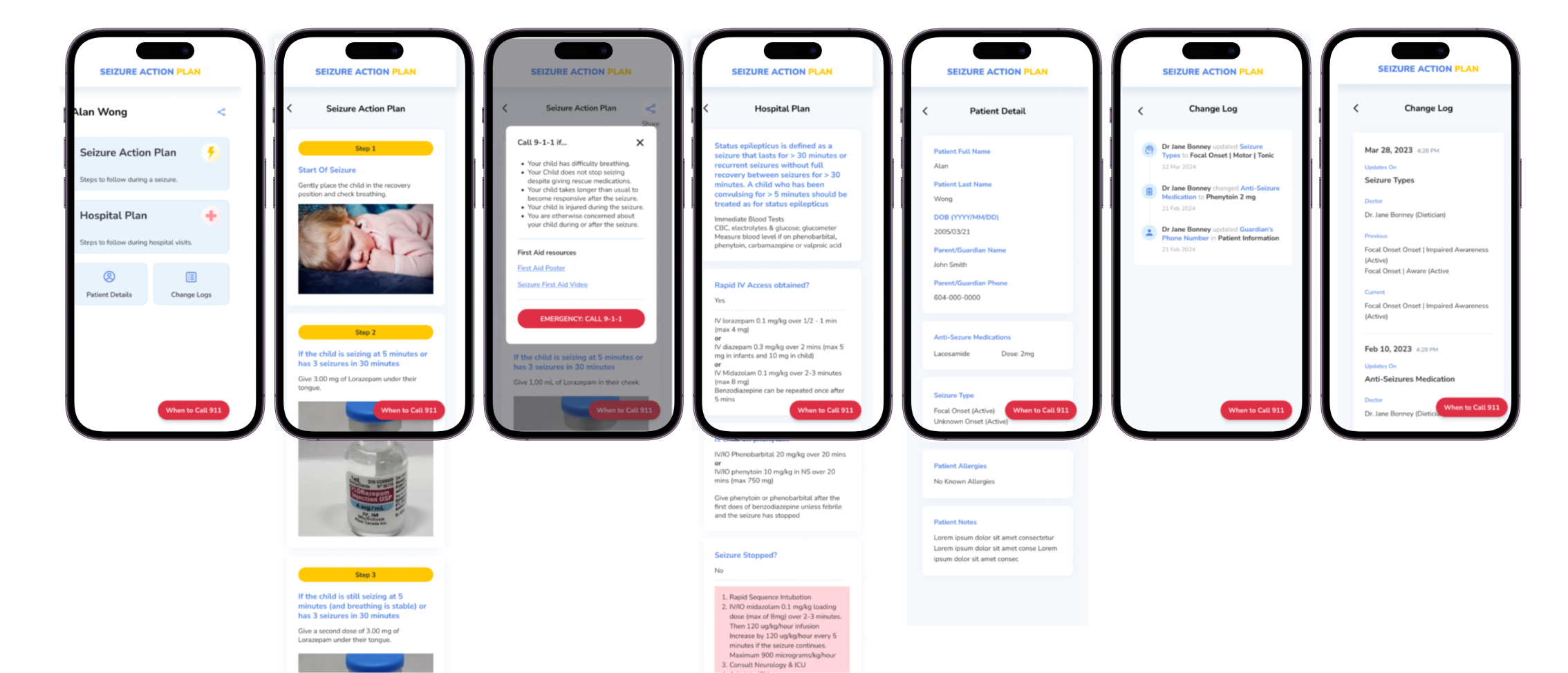
Text-Heavy Layouts Delayed Response
Complex, dense layouts slowed comprehension of the most urgent steps during a seizure event.
🔴
CTA Competed with Non-Critical Options
The "Call 911" button visually competed with lower-priority actions — leading to confusion under stress.
🗂
No Structure for Personal Plan Data
Lack of visual hierarchy for individualized care data caused user confusion and emotional overreaction.
📞
Unnecessary Emergency Calls
High rate of unneeded 911 calls traced directly to poor UI hierarchy and missing visual cues.
03
Value Prioritization
Rating dimensions
Clinical protocols — BCCH stakeholder priorities
Caregiver clarity — speed of understanding
Risk level — safety and time-sensitivity impact
Top-rated goal: enable caregivers to read and act on the seizure plan quickly — and call 911 only if the plan fails.
Speed
Readability
Safety

04
Ideation & Design Direction
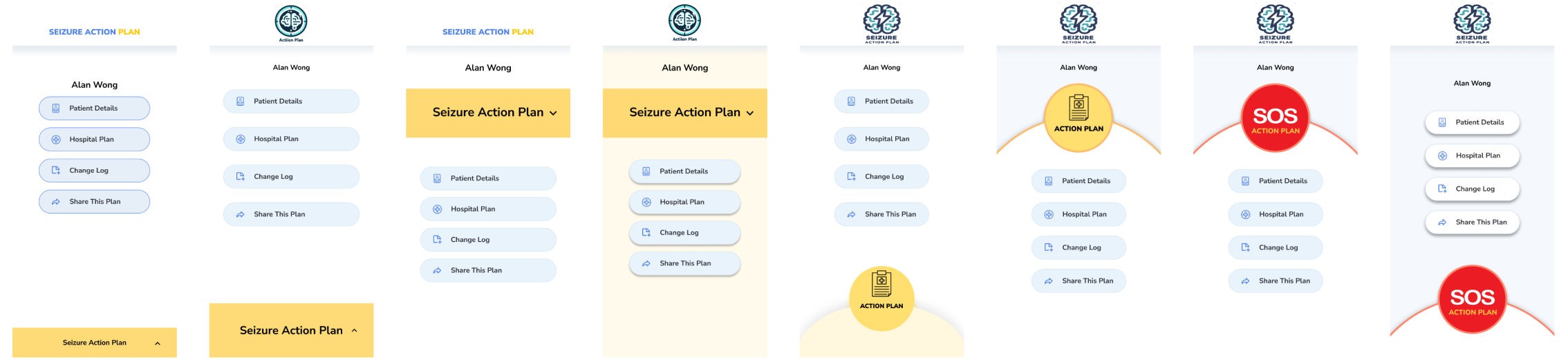
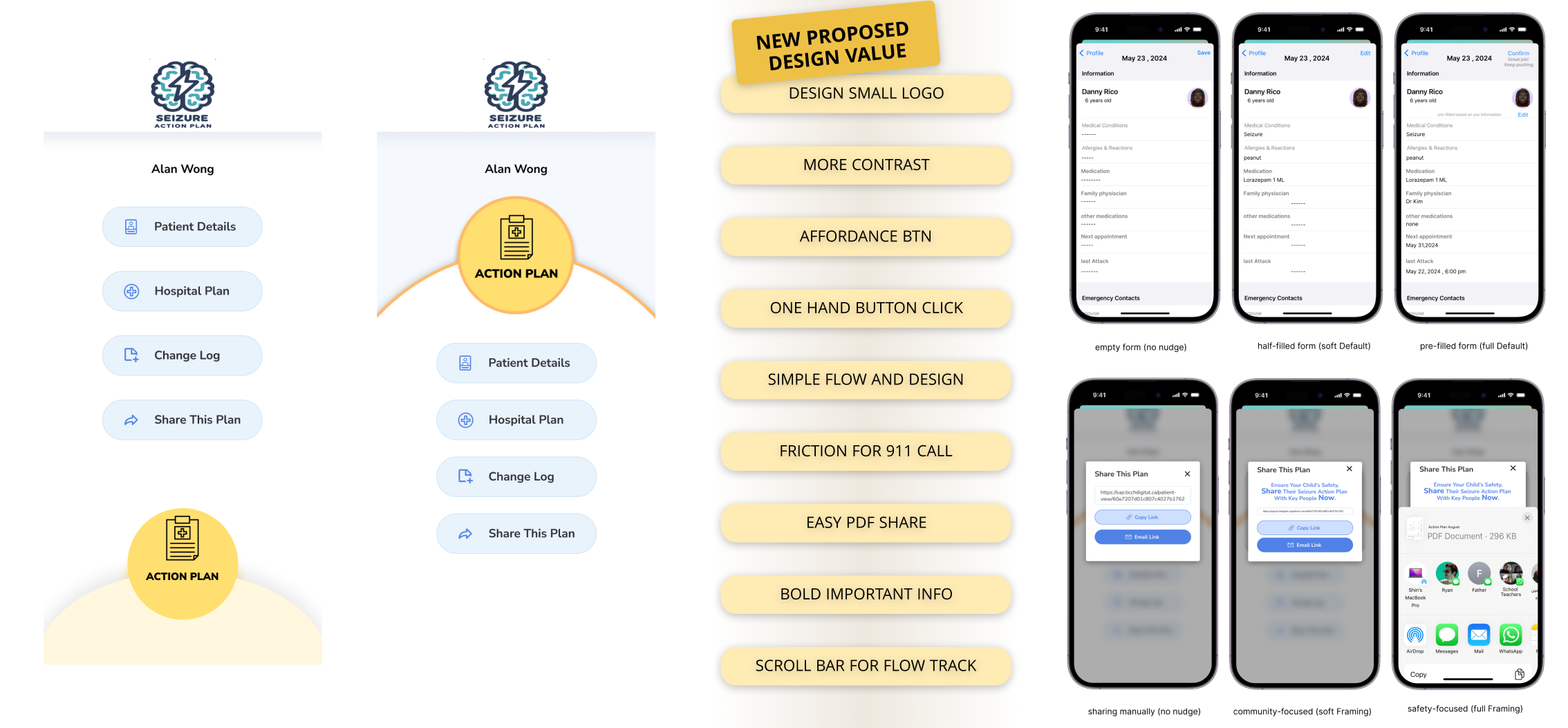
Eight versions developed across six design dimensions. Two were selected for A/B testing based on value-goal alignment.
Colour Cues & Contrast
High-contrast visual hierarchy to separate urgent from non-urgent actions at a glance.
CTA Repositioning
Tested different placements of the primary action button to reduce accidental taps.
Minimal Hierarchy
Stripped-back layouts showing only what's needed at each step of the response flow.
New Logo Design
Redesigned app icon to reduce misclicks during high-stress emergency situations.
Button Size & Shadow
Larger touch targets with depth cues following affordance principles for stress scenarios.
Dual-System Thinking
Supports both fast (intuitive) and deliberate decision-making within the same interface.
05
User Testing
50 participants — caregivers and general users simulating caregiver roles — tested both versions via Maze under time constraints.
Testing Goals
Measure time-to-CTA and reading duration for personalized plan data
Observe task success under time constraints
Analyze error rates and cognitive detours (incorrect 911 calls)
Results
Average reading time reduced by 44%
Unnecessary 911 calls down 35% in pilot phase
Version B: higher comprehension & faster task completion
Caregivers reported greater confidence following the plan
44%
↓ Before: ~45s → After: ~25s
Reading time for action plan
35%
↓ Pilot phase reduction
Unnecessary 911 calls
91%
↑ From 58% baseline
Task success rate
06
Refinement & Next Steps
Upcoming
Digital Nudges
Subtle prompts to sustain attention and guide dual-system thinking — colour feedback and stress-aware defaults for high-stakes actions.
Upcoming
Smart Defaults
Pre-filled thresholds to reduce decision-making time. Contextual visual cues to help caregivers verify correctness under stress.
Upcoming
Contextual Cues
Visual reinforcements helping caregivers confirm they are following the right steps — reducing second-guessing in critical moments.
Upcoming
Behavioral Analytics
Future tracking of task flow and dwell time to surface where users hesitate and further optimize the response sequence.
"
Each second saved is a life-saving opportunity — design can make that difference.
Value-centric research aligns institutional and user priorities — sharpening design focus in high-stakes health contexts
Time-to-comprehension is a critical UX metric in emergency contexts — every second of friction costs real-world safety
Digital nudges bridge the gap between intent and action — turning a static medical document into a responsive care tool